Cake Castle
Cake Castle is located in Kerala, India and its equipment’s being used are best and the Latest technology in the field of Bakery and Confectionery. Cake Castle serves with a wide variety of cakes, comes in all shapes and flavors. They have created multiple relationships in a short time, with thousands of happy customers.
Overview
Cake Castle was established in September 2015 and is now one of the most fast-growing confectionery in South India, Kerala. For enlarging their business, they approached our team to build a website. For this work on Kerala as a group of three people, we received the briefing and worked for three weeks designing a new website for this Cake Castle in Kerala. Focusing our efforts on delivering great shopping experience in order to find solutions for the end users.
Role
UX Researcher, UX Designer
Methodes & Tools
Market research, Lean Survey Canvas, User Interviews, Affinity Mapping, User Journey, User flow, Site Map, Wireframes, Moodboard, Competitive Analysis, Moscow, Agile Development,Google Forms, Sketch, Miro & Sticky Notes
The Challenge
Customers who purchasing cake online deserve to be able to sense and appreciate the quality of the cake when experiencing the fun and essence of a local physical bakery store, so buying cake online is an impersonal experience that
can be enhanced.
The Solutions
We assume it would draw happy and repeat buyers to give a tangible sense of familiarity in the bakery and cake shop. When we see a spike in favorable feedback and scores, we will know if we are right.
User research
Empathize
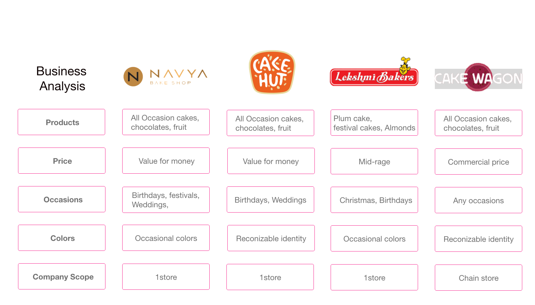
We have to go straightforward for our company to initiate the work and understand the experience and consumer expectations in all their intensity as a real live individual. With that in mind, we started visiting Cake Castle to understand the organization and create a Market and Function Overview that could help us to better understand the bid, future concerns, priorities, and community of the cake universe.

We chose to build a Lean Survey Canvas as the second phase of the Empathize process, inserting all the ideas we had from the previous study.
We could continue to prepare questions for our quantitative and qualitative analysis with the findings of the Lean Survey Canvas on our side, in order to better understand the group, we interacted with.
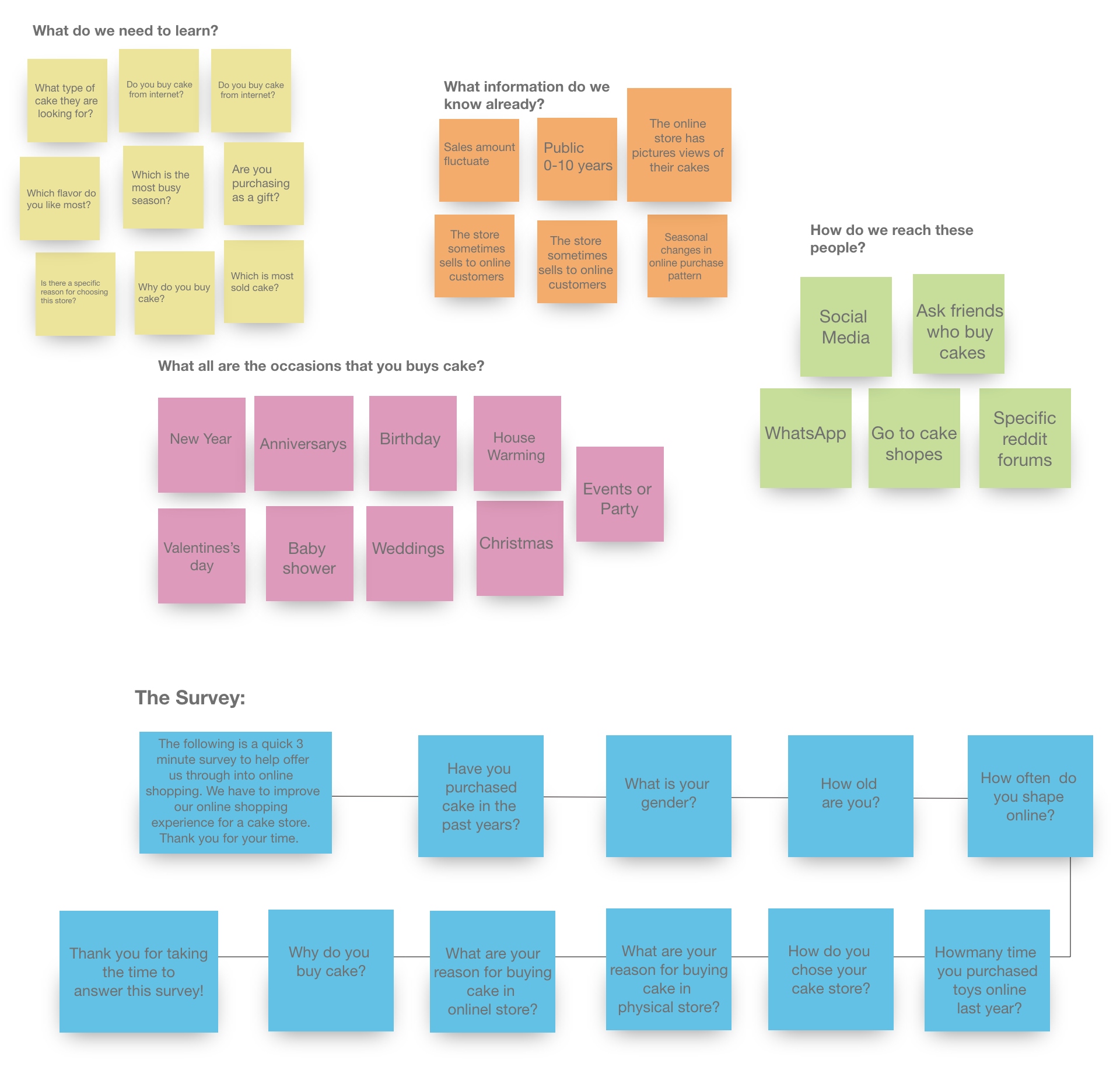
Research insights
Define
We began to formulate an Affinity Diagram based on the main observations, organizing all the knowledge we had from qualitative and quantitative studies. The findings have told us that they search for credible websites, ease, more choices, and referral as users shop online. For physical shops, on the other hand, the customer likes the concept of getting a true cake experience before purchasing, testing the size, style, taste, color, etc.
Problem Space
Issues we found from research
- Delivery issue
- Lack of significant discounts in online shops
- Lack of touch and feel of merchandise in online shopping
- Lack of interactivity in online shopping
- Payment Insecurities
- Difficult to exchange items
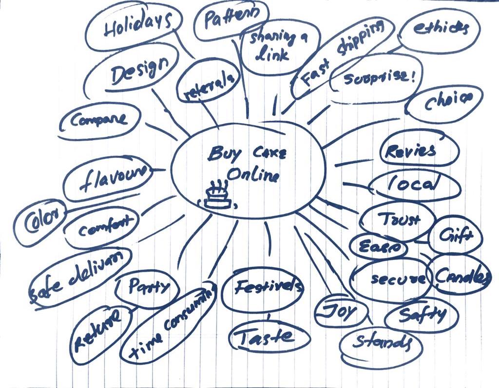
Brainstorm
We began brainstorming about the theme of purchasing cake online, speaking about how we can maximize the customer experience. We could create a lot of ideas by looking at our personas and all the data we had received from the users.
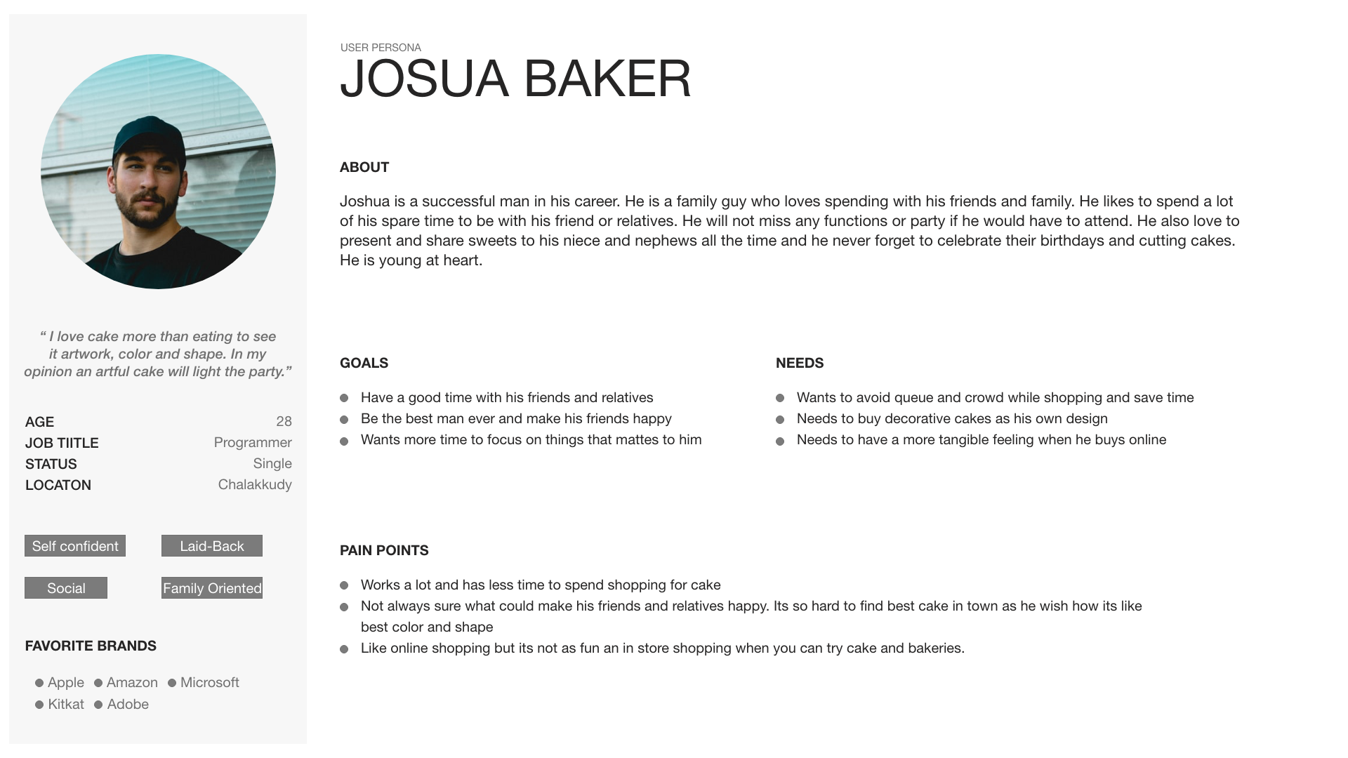
Persona
Understanding the user
We used Pesona and empathy map for the define methodes which helped us lot to figure out how to ideate the wifre framing and prototyping.
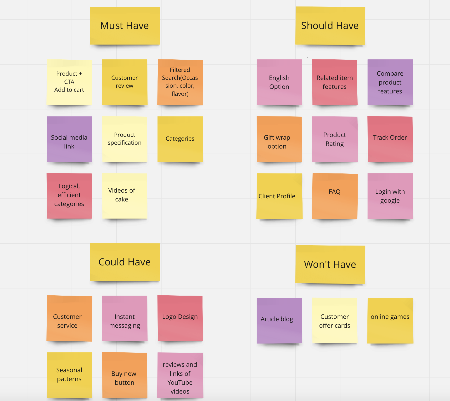
Moscow
To create a Minimal Value product, we need to have sufficient features to satisfy early adopters. For that reason, we worked with the Moscow technique, in order to decide what’s really valuable for the project and try to create special features.
Flow Diagram
Site map& user flow
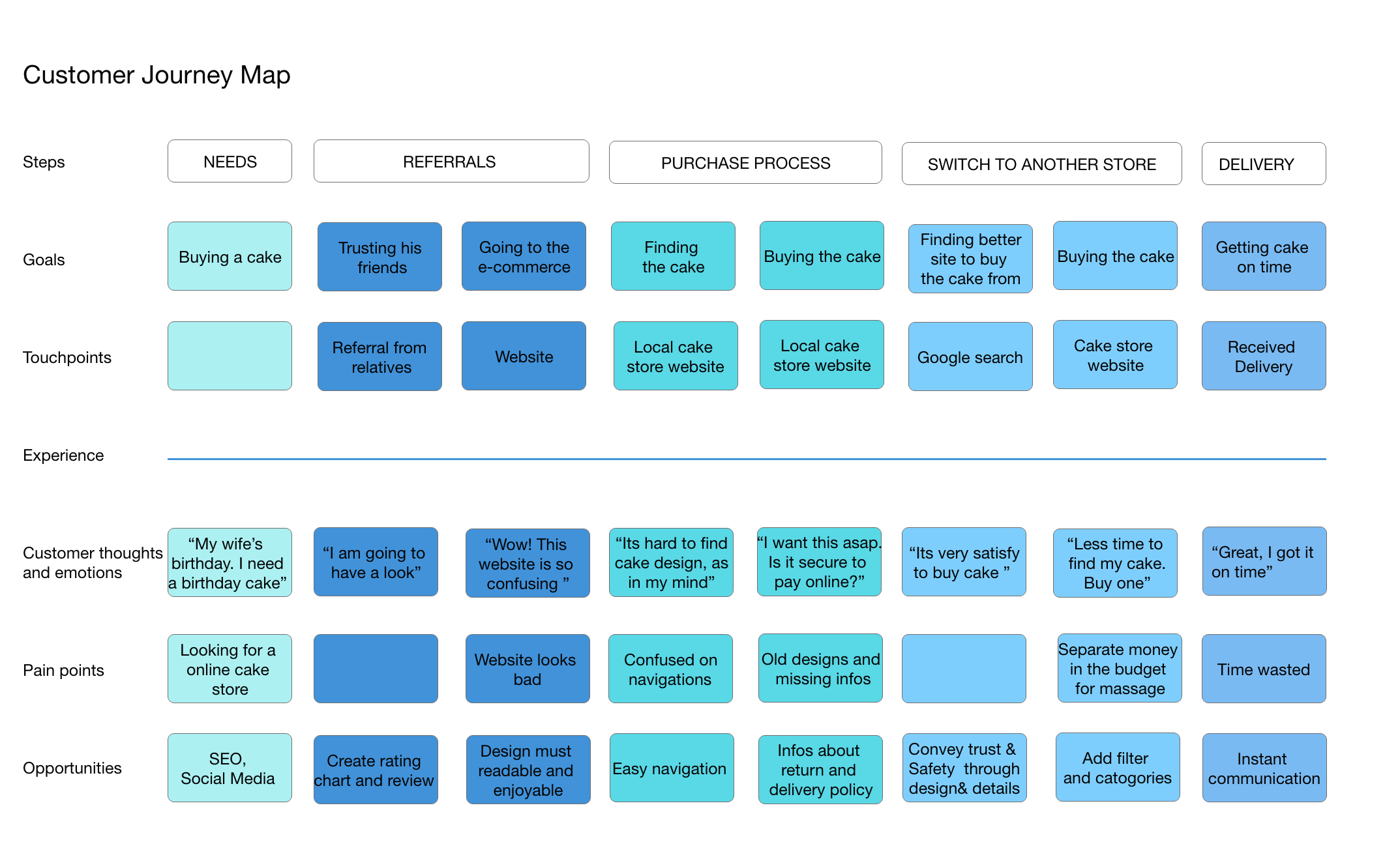
Designing for the user experience began from sketching out a typical user journey based on the accomplishment of specific tasks within the app. Once the user journey had been established, the team began to unpack the design flow for general and specific use cases.
We started to develop the Information Architecture defining the overarching structure and relationship between all areas of a website. We made a Site Map in order to create the relationship between pages in a site and document the organization, navigation, and labeling.
User Flow
In order to understand the path of the user to complete the task to buy a cake, we created a User Flow with the main steps for the user.
Mid-fidelity prototype
Designing initial interface
In order to digitalize our sketches, we also worked in a mid-fidelity prototype as you can see in the video below.
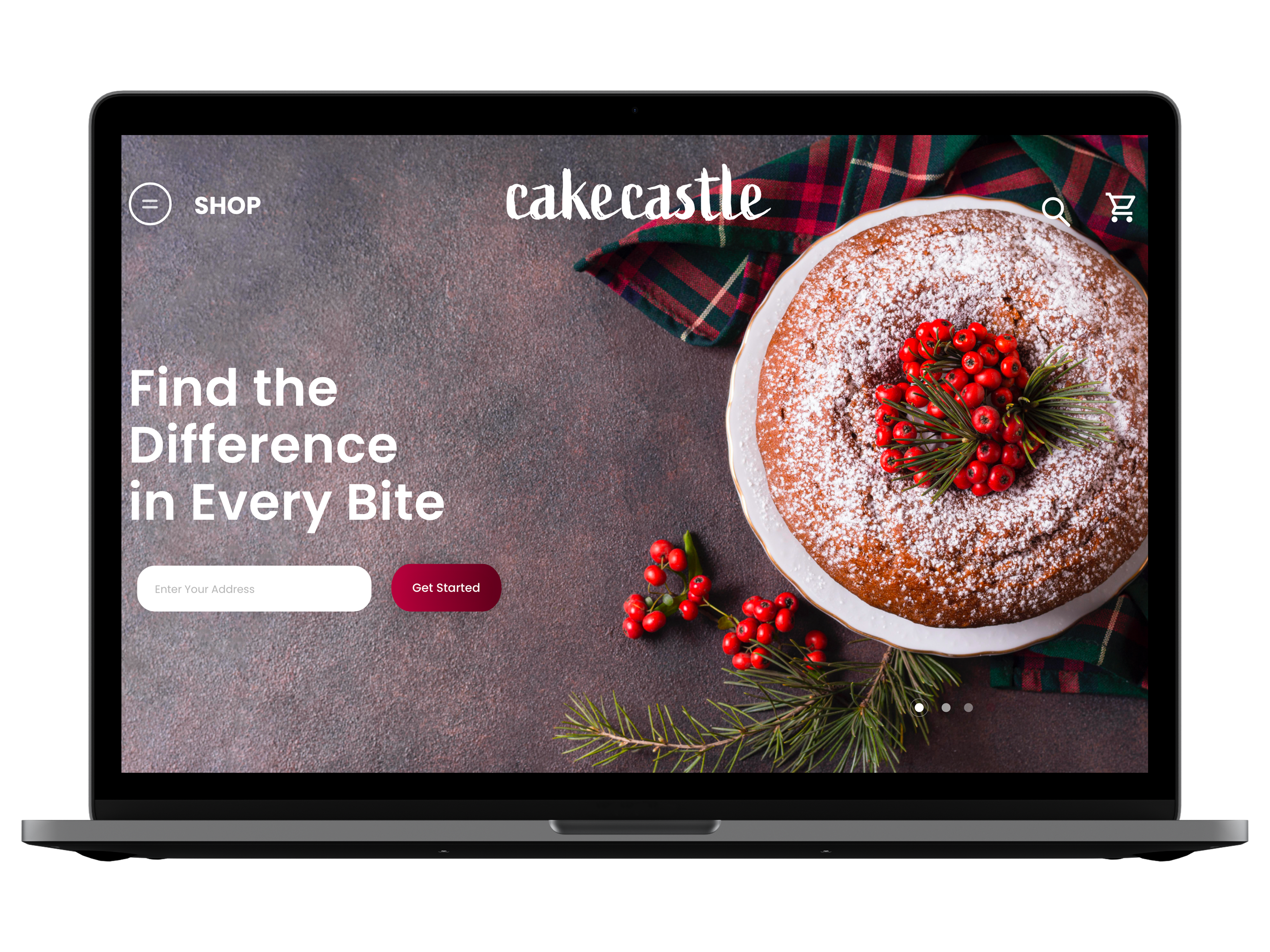
Cake Castle website
High Fedility Design
On my solution, I tried to be more focused on what the user is looking for. Adding a clear call to action buttons, and showing information based on what the user considers important. I also removed unnecessary steps from the sign up form, creating less friction and giving more control to the user.
Conclusion
Reflection & learning
As the Design Thinking method is a continuing process we should always have in mind that improvements can be made from the prototype until the implementation. The next steps could be to present the project for the cake store and see if they are interested in it. They already liked the results we showed them after conducting the usability test, so would be nice to hear their feedback about the prototyping results.